

Overview
Competitive Analysis
User Interview
Affinity Map
Personas
User and Task Flow
Site Map
Affinity Map
Brainstorming (Low-Fidelity)
Branding
Typography and Icons
Mid-Fidelity & High-Fidelity Wireframe
Testing and Prototype
Role
Researcher
and Product Designer
Tools
Figma
Problem Discovery:
How do you keep track of all the video games you have played and want to play?
The gaming landscape has a diverse demographic spanning all age groups and multiple gaming platforms. Given the widespread availability of video games on various platforms, it is not uncommon for individuals to own the same game on different gaming consoles, especially when seasonal sales for certain games come around. As a result, keeping track of one’s game library becomes challenging.
After thoughtful consideration, I came up with the idea of designing an app to assist users in tracking and organizing their extensive game collection. Level Up Ledger was the result - designed to aid users with a vast array of games across multiple gaming platforms. During the beginning process, I had to deliberate on what elements were crucial to incorporate into the design and how to effectively address them, recognizing their significance for users.
Critical elements that require attention and resolution:

Keeping track of all owned games
Too many games on multiple platforms
Being able to organize owned games

The Challenge and Solution:
The objective is to construct a comprehensive and functional application that helps users efficiently track and organize their game collections as well be visually pleasing.
The proposed app will offer the following features to users:
Track and organize games
Plan and manage purchases, including upcoming game release
Categorize games based on genres and platforms
Provide additional features like wishlists and favorites for personalized collection management
Enable Users to explore and discover new games through intuitive browsing and search functionalities
By incorporating these features, the app aims to enhance users’ gaming experience by streamlining game tracking, organization, and discovery.
Would be nice to have: The ability to link up users’ Steam, EA, Xbox, PlayStation, and Nintendo accounts to the App to seamlessly transfer game ownership information.
Research
To find out what types of features users will want in a gaming organization/tracking app, the first step is to conduct a thorough analysis of competitors and existing applications that might have similar features. From this research, I will be able to start creating a distinctive app that perfectly aligns with the needs of my targeted audience.
Competitive Analysis
First, I analyzed four tracking Apps, aiming to identify and extract desired qualities and features that align with the objective of this project. By surveying the common patterns across these Apps, I conducted a visual chart to discern and evaluate their shared characteristics. This approach facilitates a clear understanding of the similarities among the selected applications and provides me with a solution that will tailor to the specific needs and requirements of this project.
*Click the image to enlarge
User Interview
During this process, I created a series of questions to facilitate a deeper understanding of what specific features could benefit each individual’s requirements.
Participants: Avid gamers with an extensive collection of owned and played video games
Number of participants: 3
Interview method: 1:1 virtual calls

Affinity Map
In the interview process, I documented statements from users that exhibited similarities.
During the analysis of participants' responses, consistent patterns and shared characteristics emerged, which I documented on a Post-It note before focusing on the most prominent ones for integration into the App.
I organized the answers into categories for a clearer perspective and to generate objective ideas that can be incorporated. There were some overlap in the responses provided by users, indicating they shared similar preferences.
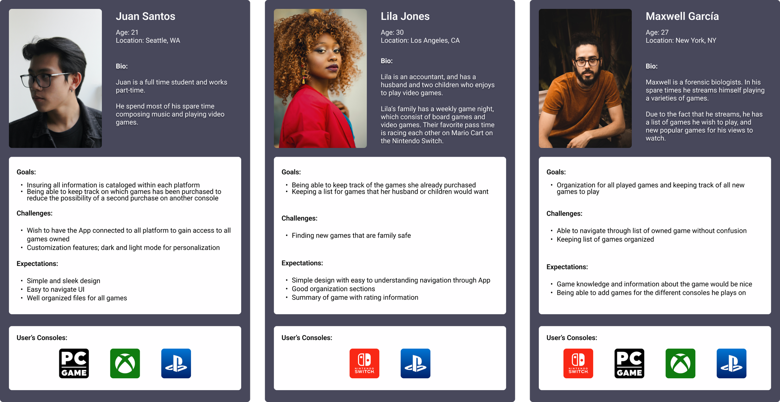
Personas
I developed three user personals rooted in the interviewees' shared needs for a video game-tracking app allowing me to comprehend user objectives, expectations, and pain points. This help in shaping the app to better address their requirements.
.
Design Process

I mapped out all potential routes and any potential errors users may encounter through the App.
The initial user flow outlines the new user sign-up process, while the subsequent sections delve into the app's navigation details. I crafted this flow with insights derived from the interview participants. Notably, user behavior indicated that most users will primarily browse through their profiles, categorize their games, and search for new games to add to their collections.
User Flow and Task Flow
Site Map
The flow of the overall App was laid out so I can see a clear picture of how users will navigate through the App. A clear navigational bar that outlines the placement of each component and feature within their respective categories, ensuring a more coherent understanding. Though the final conclusion of it may share similarities, this may change during my building process depending on other needs within the app.
Brainstorming
I sketched multiple designs for the sign-up onboarding screens, profile, and game page, as well as a game browser since these are going to be the pages users will visit the most.


Branding, Typography, & Icons
Designing the Logo
For the logo design, I did multiple pages of sketches to see which ones would best represent this app and which would be eye-catching. At first, I sketched designs with just the name of the app, but I found that it did not illustrate what this app represented.
The color scheme I chose to use was inspired by old retro games, I aimed for a retro 80s vibe with muted colors and dark undertones to strike a balance between vintage and modern aesthetics. While researching gaming websites, I noticed popular uses of dark colors with vibrant contrast and found many of my interviewees seemed to be drawn to these colors.

I thought of objects that would best represent video games, gaming consoles, and keyboards were the first objects that came to mind. I sketched a few designs to gauge how it would work. I wanted to keep the logo simple so it was easy to distinguish from others, but still be recognizable.
I decided on having a draw up multiple images of objects that would best represent video games. The first thought was to use a game controller as a logo but decided to go back to the drawing board on my other options.

As I stared at my keyboard, I came to realize that many users such as myself also play video games on their computers. I took inspiration from my keyboard in front of me and drew a few designs that would best illustrate the main characteristic of the App within this logo.
After editing a few of my sketches, I narrowed down to a few of the selected designs that I will digitalize for the main logo
Color Palette and Fonts
Below is the final pick and digitized logo design selected from the sketches. Because many people I interviewed mentioned they wanted the ability to customize the lighting modes on the app, I kept in mind to be sure the color for the design works well in both light and dark modes.

Mid-Fidelity Wireframe
With the framework mapped out earlier with the sketches, site map, and the user and task flow, I came up with multiple pages that are crucial to improving the functionality of the app
Important pages to include:
Log-In and sign in
Profile
Search options with advanced filters
Game page with information on the game
All games: popular, new, and upcoming games


High-Fidelity Wireframe
After I created the Mid-fidelity wireframe, I started incorporating the color scheme I had picked. I included some animations to some of the tabs and buttons to give it a better effect during the prototype and the testing process.
I went for a sleek, modern retro feel, pulling inspirations from color themes of different games as well as apps and websites. I also included a light and dark mode, that users can change based on their preference.
Profile

The profile page includes categories for users to find and organize their games efficiently.
Games are organized based on:
Platforms - users can go through which games they have based on their consoles
Statues - users can see which games they are currently playing to completed. This also includes games users wants and favorites.
To solve the problem of users owning multiple games on multiple platforms, I integrated a functionality that permits users to categorize their games by platform. This addition prevents unintentional duplicate purchases. For user convenience, I prominently positioned each platform category on the user's profile for easy access.
Game Page

The game page features pricing information, a game summary, user reviews, and a trailer for the gameplay if available.
Users can categorize and organize the game into specific categories, such as "Completed," "Wish to Play, and their preferred platforms.
I positioned the review section as a pop-up, resembling the platform pop-up on the user's profile. This design choice minimizes clutter and enhances user accessibility for reviewing the game from anywhere on the page.
Game Browser

The game browsing page includes a comprehensive collection of available games. I incorporated the top-requested game categories, including new releases, upcoming titles, and popular games based on the feedback I received from user interviews, where most participants expressed interest in these categories over searching by genres. The top bar features further categories, such as "Recommendations," "Free to Play," and "Family Friendly," which users can access
Due to the abundance of new and upcoming games, the sheer volume could overwhelm users. To address this, I intentionally integrated a filter bar into each category, allowing users to search through the game list based on genres. This adjustment was made based on user feedback, as many expressed frustration over the lack of filtering options, in their search process.
Testing & Improvements
Testing the user flow is to gain insight into any usability errors and design flaws or confusion. Users will be asked to go through the prototype and navigate through the App freely as they would any App. The reason I did not give any direction is that many people will dive into a new App blindly and explore on their own without a guide. I want to gain a better insight into how users will navigate so I can know if anything is amiss or confusing for them.

5/5 liked the overall design and aesthetic of the App.
5/5 stated the navigation was smooth, straightforward, and easy to understand.
5/5 liked the option for a dark mode. Some stated they wish more apps had these options or something to personalize it.
5/5 liked how everything is laid out with the games being organized within the profile page and in the game browser.
4 out of 5 pointed out that the game titles of the images were cut off when they scroll down the list
3/4 was confused by the Collection tab on the profile page. Because they didn’t know what collections meant. Participants requested it to be renamed to Platform if the tab was meant for the gaming platform.
3/5 page showing a review button with the category was confusing and redundant.
Making minor changes and improvements from users inputs
A small minor changes were made before everything was finalized. I learned from user testing and feedback that some parts of the interface were unclear and confusing.
Here, highlighted in pink, are the small changes done to the profile. Users started how it was confusing to have the “reviews” shown twice and claimed it would have been better to change the tab for their favorite games.
Next was the tab that shows the different platforms, users made it known that it would’ve been best to state clearly what it is since collections were too broad and could mean several things such as genres, and favorites. - too similar to the tabs showing, “playing, complete, want, and favorites”
So changes were made here and this was a better fit as it lines up with the initial idea.

Key Takeaways
The primary goal was to develop a user-friendly gaming app with a clear organizational structure. I achieved this by incorporating essential features to streamline the organization process.
Throughout this process, I gained two valuable insights: first, never make assumptions about users’ preferences, and second, many users share similar needs, particularly in terms of organization and item tracking.
Overall the process was insightful and I gained considerable knowledge from this design. While there were some additional features I wanted to include in the design, I recognize that they are minor and not essential. The primary focus remains on ensuring that users can efficiently locate their games across various platforms, thus preventing accidental purchases and eliminating any uncertainty.