

Introduction
“Turnip Boy Commits Tax Evasion” is a charming indie video game, which is playable on Steam and Nintendo Switch. The game immerse players into a wonderfully absurd universe where vegetables find themselves in tax trouble. As you control Turnip Boy- a most unconventional hero- The goal is to complete a series of strange combat challenges and puzzles to pay back the massive debt to Mayor Onion.
While the game’s adventures and experiences were engaging and enjoyable, I did encounter some frustration in combat, if addressed, has the potential to significantly enhance the gaming experience. This led me to consider potential solutions for the frustrations I encountered and how they could be effectively resolved.
Disclaimer: This case study is a self-driven study project to analyze game UI for educational purposes. All images used are credited to the creators and developers within Snoozy Kazoo who created “Turnip Boy Commits Tax Evasion”.
Overview
Research
Competitive Analysis
User Interview
Affinity Map
Design Process
User and Task Flow
Brainstorming (Low-Fidelity)
Mid-Fidelity Wireframe
Testing
Prototype
Tools
Figma
Role
Researcher, UX and UI Design, Visual Design, Product Design
Problem Discovery:
The puzzle challenges and combat scenes within the game were highly engaging during my playthrough of “Turnip Boy-”. However, I observed certain areas where the game's user interface and equipment management could be enhanced.
One notable aspect was the lack of visual cues for weapons. Players had to access the UI screen to change equipment or rely on cycling through items using the left and right controls, which might not be very intuitive in the middle of combat. Additionally, the equipment and inventory display would benefit from improved organization to clearly differentiate cosmetic, passive*, and equippable items for a more user-friendly experience.
*Passive items: are non-weapon items that give the player bonuses to their stats
The Challenge and Solution:
My challenge would be creating a simple and straightforward feature of the equipment/tool display that sits well alongside the Head-Up Display (HUD), without distraction but stands out enough for players to see without blending too much into the background. I also reorganized the equipment and inventory UI, ensuring clarity for players when they navigate it.
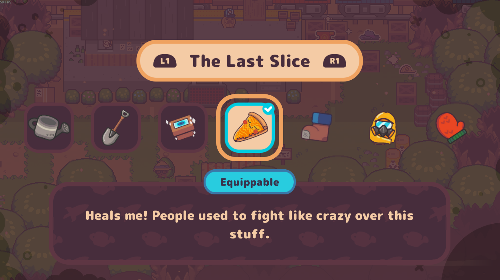
Before

Previously, all weapons and passive items were shown on a single screen. To enhance user navigation, a review of item design was conducted.
The challenge was that the four passive items—located at the end of the list—were indistinguishable from the equippable items. This could lead to user confusion as they were not explicitly labeled as passive.
After


In the new design, I integrated all weapons and equipment into a single user interface for easy access to in-game items. I adapted the existing overlay from another UI screen to maintain consistency in the design. In this updated layout, the final four items have been categorized within the “Items,” tab and are labeled as passive equipment. This clear labeling helps users understand their perpetual functionality when users acquire the item.
Before
As the game's HUD (Head-Up Display) lacked a weapon wheel on the screen, I redesigned one that maintained the existing in-game icons and design elements and strategically placed it on the left side of the screen.
After
The weapon currently in use are highlighted in blue and slightly larger than the other inactive items so users know which items are selected. Users can easily rotate through the weapons wheel left or right, enabling them to choose the desired weapon effortlessly.

Research
In order to better understand what features players expect during gameplay or on the HUD, I gathered information and opinions from people who have played “Turnip Boy Commits Tax Evasion” or similar RPGs, and have played various games to gain better insight into users’ experiences and preferences.
First, I reviewed 5 competitors to see what type of features they are using and if they have any similar features I am looking to build. I reviewed the design, layout, or placement of the feature to better understand the pattern and how it affects players’ usability.
Competitive Analysis
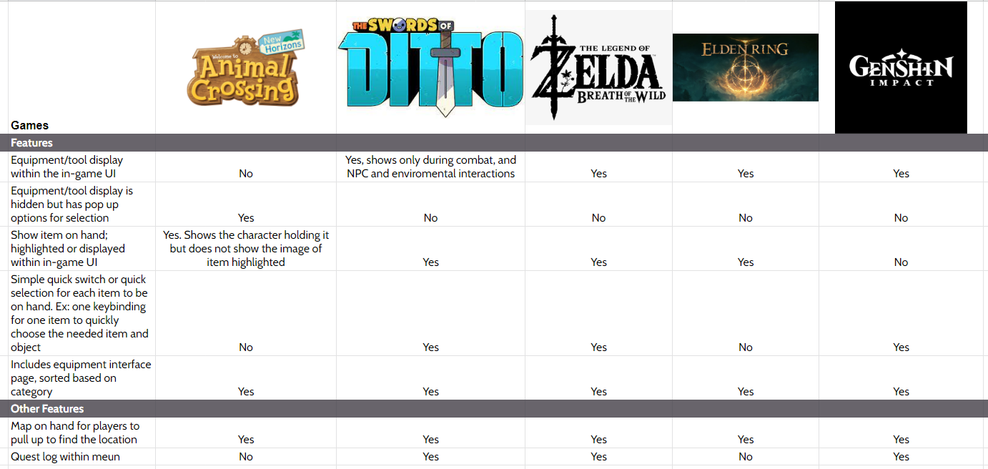
I focused primarily on role-playing games and adventure games similar to Turnip Boy Commits Tax Evasion. While reviewing these games, I noticed a recurring trend of specific features within each of them.
As seen within the chart, 4 out of 5 featured items are highlighted or displayed within the in-game UI, and visible equipment or tool are displayed on the screen. The information collected gave me a good insight into how the design process should be since it is a universal layout across the board for many of these games. The design may differ from game to game but the logic of how the mechanic of the feature should be laid out for the user is fairly straightforward- using icons as visual directional queues, and simplifying the design to eliminate confusion.
User Interview
To better understand and gain insights into users’ preferences and expectations, I seek out users who play role-playing games for my interview process.
Participants: Users who played role-playing games (RPGs)
Numbers of participants: 4
Interview method: 1:1 virtual calls
Affinity Map

Throughout my interview process, I found a trend within the participant’s answers and opinions.
4/4 agreed and expressed a preference for a well-structured presentation of information or items
3/4 stated a world map or mini map is essential
4/4 confusing features can ruin the experience of the game
Prefer use of colors, items being highlighted; visual guidance within the game
The frustrations of all participant’s experiences are:
Having to navigate through confusing UI
Feeling lost or unable to find the tools or information needed
Personas
These personas are derived from common traits found in the interviewees I spoke with. By incorporating similar characteristics as those of the interviewees, I gained valuable insights into users' goals, needs, motivations, and frustrations. This approach ensures that the main focus of the feature aligns with users' preferences and requirements.
Design Process
User and Task Flow
The user flow represents the overall game navigation, which remains unchanged as it aligns well with how many players naturally navigate. The graph serves as a visual representation to identify potential areas for improvements, if any.
On the other hand, the task flow focuses on the changes that will be implemented. It serves as an example of how users will navigate through the inventory and other features within the game, showcasing the enhancements and improvements made to streamline the user experience.

Brainstorming
To establish the layout for the tools and weapons on the HUD screen, as well as the new inventory UI, I drew several sketches to explore different design options and determine the optimal arrangement.
I revisited the existing in-game UI and found the layout to be visually appealing and straightforward. I want to keep with the aesthetic of the menu screen so I made sure to take that into consideration. My primary focus was to create an organized and user-friendly interface without deviating from the original UI’s overall design concept.

Mid-Fidelity Wireframe
From my initial sketches, I carefully selected the most suitable lo-fi wireframes (from the sketch) that aligned with the overall game design. Subsequently, I transformed these wireframes into digital mock-ups, refining the design process.


In order to maintain consistency with the game’s aesthetic, I incorporated screenshots and the original menu border into the redesign of the inventory and equipment page. Additionally, I revisited the game and decided to retain the same design for the item information. After I conducted further research, I selected two preexisting designs and merged them together. As part of the reorganization process, I consolidated all the inventory and equipment pages into a single tab for easy user access.
Next, I worked on the mid-fidelity wireframe for the weapon/tool feature. I originally sketched and included a mini-map due to the number of people during my interview process that stated how having a map or mini-map is a must to them. However, I decided not to proceed with it due to the size of the world map.
The weapon wheel was chosen for its ease of rotation access during gameplay. With only four items that the character can carry and use, the wheel provides the simplest and quickest way for players to access the items they need. Its left or right rotation nature allows for effortless and efficient item selection.

High-Fidelity Testing
Enhancing User Experiences through Usability Testing
I conducted a play testing with 4 users, all experienced players who have played a broad range of games.
The goal was to determine if the participants would be able to complete and understand the task flow. I observed their walk-through and obtained their feedback for any improvements.
I asked the participants some questions, did a side-by-side comparison for users, and asked which they preferred, 4 out of 4 stated that they preferred the new design feature.
4/4 liked how the Equipment and Items layout looks well organized.
4/4 liked how all items are within the same UI for easy access.
3/4 claimed the label of passive items made it clear what these items are.
4/4 liked the weapon wheel on the screen and it gave them a clear view of the order of items on hand without guessing.
3/4 stated the weapon wheel located on the right felt cluttered.
4/4 felt the weapon wheel was small, users want it to be bigger for better visibility.
2/4 wanted the main selected item to look bigger to be distinguished from the other items on the weapon wheel.
One user stated the color of the passive equipment was too similar to the equipment so they thought they were the same items.
Getting feedback on user's problems and preferences helped me figure out what I needed to do to make their experience with the game better. With the feedback provided by individuals who tested my prototype, I reviewed my prototype and made some changes that ensured better usability.
Key Takeaways
Embracing Growth Through Feedback, and Overcoming the Mistakes to Improve
I tackled this project with the intention of improving a video game I enjoy, and through that process of interviewing and testing, I learned two things that helped me understand what people want in games and how I should approach them.
The first is that an unclear and difficult UI can lead users to experience the game negatively. The second is that users want to know and understand what they are looking at within the first few seconds into a game.
In order to improve these, it is extremely crucial to understand how the UI works and redesign it in a way that includes features that will help users navigate the game easily. I wanted to improve the game without disrupting the integrity and vibe of the game, and I did that. I created and reorganized an user interface and inventory page that’s easy for users to use, and made a weapon wheel feature within the HUD (Head-Up display) for quick information access during game play. With these changes, it makes the whole experience of Turnip Boy Commits Tax Evasion better.