


Enhancing Clarity: A Website Redesign
This redesign aims to elevate user experiences through a clearer and more organized webpage design, enhancing navigation and usability.
Introduction
Square Enix Co., Ltd. is a renowned Japanese video game developer, publisher, and distributor, celebrated for crafting and releasing major video game franchises like Final Fantasy, Dragon Quest, and Kingdom Hearts. Their websites serve as platforms where users can explore and discover information about their latest releases and popular games.
The current Square Enix homepage features a visually engaging collage of images, providing users with a mosaic to explore. It includes a variety of news articles covering different games, updates on recent releases, and details on where to purchase the games. However, the abundance of information is unlike other video game developer websites. This raises questions about whether this level of information might overwhelm users and prompts consideration on how to enhance user appeal.
Disclaimer: This case study is a self-driven study project to analyze the website’s UI for educational purposes. All images used are credited to Square Enix Co.
Competitive Analysis
User Interviews
Affinity Map
Personas
Overview
User and Task Flow
Site Map
Low & Mid Fidelity
High Fidelity
Role
Researcher and Product Designer
Tools
Figma

The Problem:
The homepage looks cluttered; it makes it hard to distinguish between news articles and game purchase pages. The random arrangement of the images contributes to a busy and overwhelming experience for users when they first see the homepage. To address this issue, my focus is to streamline and update the design to create a cleaner and more refined version that will make it easier for people to navigate the site.
The Challenge and Solution
My challenge and objective are to redesign a homepage that offers effortless navigation for users while avoiding overwhelming elements. My design is aimed to captivate users while delivering valuable information that users find relevant across each page.
Home Page
Before

No hero session on the landing page. No information on what are newly released or popular games as a hierarchy.
Multiple users have stated:
The page looks confusing at first glance
Busy looking
They feel a bit disoriented when navigating the home page as it does not show the first few pieces of information they want:
Popular games
New releases
Randomly sized images of both news articles and information on new games to play.
Overall the appearance looks disoriented and lacks categorization, (ie. news articles and newly released games not differentiated in a way that distinguishes one from the other.)
Multiple news articles of the same game they are promoting. Unsure where the actual poster promotion is so users can view information on the game itself.
After

A hero session is strategically positioned to highlight the promotion of the latest game release.
This serves to convey important information, including sales or other significant news, prominently in the header section of the website.
In order to draw attention to the new releases, it is displayed in a larger banner. Enlarging the banner ensures its visibility. Additionally, there is a possibility to implement a hover effect that flips the banner, allowing users to view a trailer when they hover their mouse over it. With a larger image, there is ample space to create additional visual elements that pique users’ interest.
Based on feedback from users wanting a popular games section, a carousel scroll is implemented near the top of the page to showcase popular games. This feature aligns with the users’ intentions of visiting the website to explore popular and new game releases.
The final two high fidelity can be seen here.
Research
The research process involves thoroughly reviewing and studying various gaming publishing websites to gain insights into their layout and structure. Additionally, conducting interviews with users helps me to better understand their navigation preferences.
Competitive Analysis
To enhance the design of the website, I conduct a thorough analysis of competitor gaming websites. This analysis will allow me to identify similarities, differences, and successful user patterns and features present on these websites.
I have compiled a chart showcasing renowned publishing gaming sites that have been selected for this competitive analysis.
User Interview

I gathered a group of people who are likely to explore various gaming publishing websites. My objective is to ask them some questions to gather valuable insights and perspectives on users’ preferences while navigating a website.
The primary objective was to understand the specific aspects users seek, the motivations behind their visits to gaming websites, and to gather insights into their preferences, likes, and dislikes.

Affinity Map
I found a trend in participants’ answers and opinions during the interview process.
4/5 likely to visit the website to view popular, current, and new release games
5/5 show more interest in looking at games that showcase trailers, gameplay, and game UI
3/5 are willing to look at news update games
Based on the collected information, a significant number of interviewees have similar needs and preferences. The majority emphasized the crucial role of the homepage in determining whether users would further explore the website. Many expressed their expectations for the homepage, which predominately revolves around showcasing the game publisher’s most popular and newly released games.
User Personas

Conducted a User Persona as a guide to help better understand the targeted group; understanding the user’s goals, needs, motivation, and frustrations.
Design Process
Task Flows
This task flow shows a visual diagram of how users will process through the website. This will be a good starting point on how we will want to organize and make sure that the process is not confusing to any users.


Site Map
The site map highlights the top navigation bar and the footer, providing an overview of the elements users will encounter, including any dropdown tabs. The use of illustrations in the map ensures clarity while creating the wireframe for the final prototype.

Sketch
I brainstormed some ideas and came up with a few sketches of the low-fidelity wireframe. My primary focus was the home page so I sketched out more to gain a better idea of what I could incorporate into the design.

Mid-Fidelity
I reviewed my sketches and picked the best design that was the best design suited for the home page, as well as, the game and game browsers. Each page design is based on the research and user preferences gathered during the interviews.
The focus is primarily on simplifying the layout to ensure quick and easy user access. To enhance usability, the number of images on the front page will be reduced, and they will be organized into categorized groups for easier navigation.
Drawing inspiration from the initial sketches, the primary emphasis is placed on highlighting popular and upcoming games. Meanwhile, news is positioned at the bottom, as user feedback indicated it was of lesser importance to them.Home Page
To enhance user comprehension of the game, a chronological order of information is established, presenting the trailer and summary before the gameplay details. This approach ensures users can first get an overview of the game's content before delving into its gameplay aspects.Game Page
The goal is to create a captivating mosaic of all available games, showcasing promotional and popular titles to instantly grab users' attention while they browse.Game Browser

High-Fidelity Testing
I asked 5 users to go through the high-fidelity prototype, each person will go through the home page, to the game and browser page.
The objective is to comprehend the navigation patterns of each individual and identify their specific interests. I gathered feedback through observation and questions, comparing participant responses to identify common improvement suggestions.

5/5 liked the new layout of the home page and liked having the new release and popular games up front for them to see and access.
4/5 liked how the gaming page looks more engaging compared to the current one.
5/5 liked the way the browser page for the games is, many state that it is more engaging compared the the basic boring page before.
4/5 claimed the images on the browser page were too basic and wanted it to be more engaging.
3/5 stated that they couldn’t see the title very well on the game browser page, and suggested the title being shown when the mouse hovered over the game image.
5/5 stated they want more advanced options for filtering out games, such as games being filtered based on their genres.
The feedback indicates that the primary objective of improving the homepage was successful. The area requiring the most attention, according to participant feedback, was the game browser page. I've carefully considered their input and made adjustments to enhance their overall user experience. This insight greatly assisted in pinpointing the deficiencies in my design.
Key Takeaway
I went into this project to update Square Enix’s current website and gained valuable insight throughout the process. I learned that users often have an idea of what they want, primarily seeking the most popular and the newest release when visiting the website. From this information, I was able to understand what information is needed on the homepage so it would be the first information for users to see and have access to.
During the redesign of the homepage, I recognized that an excess of information doesn’t always equate to useful content, and my initial organization ideas may not suit everyone. Through conversations with multiple individuals about their preferences and needs, I realized the importance of discarding my previous ideas so I could create something universally usable.
There is much I need to learn and improve on but from this case study, I was able to learn some insight through my process and design that I can take onto my next challenge.
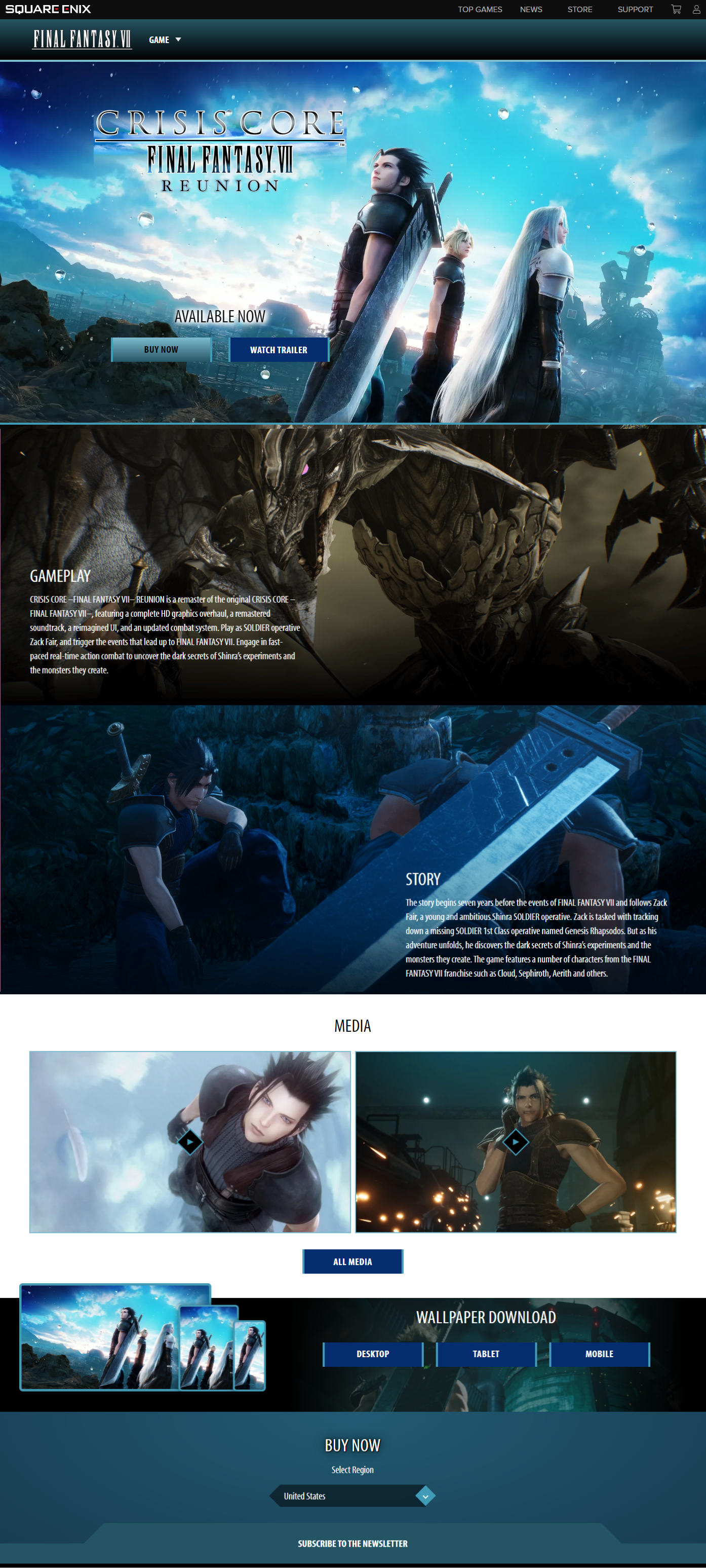
Final Prototype of the Game page: FFVII Crisis Core and browser page
Game Page:
FFVII Crisis Core
Before
For my second redesign page, I chose the game page of Final Fantasy VII: Crisis Core. I felt its overall aesthetic and design could be improved compared to other game pages. I reviewed the page of its strengths as well as weaknesses that needed improvement. Through my interview process with users, I gained insight into what they typically seek on a website when they want to learn more about a game.
Multiple users have stated:
Want to watch the trailer to gain insight into the game’s storyline
See in-game UI in action
ability to see gameplay
Screenshots and game UI
The order of the Gameplay and Story sections on the page will be confusing to users because most would expect to learn about the story before delving into the gameplay details.
While some people may already be familiar with Final Fantasy VII: Crisis Core, the existing layout fails to cater to those who are unfamiliar with the game.
When users click on the trailer or screenshots, they are presented with a pop-up window. However, it requires an additional action to click again to play the trailer or view the images. This two-step process of opening and then viewing the content feels redundant and could be streamlined for a smoother user experience.
After

To enhance the visual appeal and engage users, I incorporated texture at the bottom of the hero section and each subsequent section to break away from a monotonous boxy appearance.
I implemented a visual direction technique that guides users’ attention as they navigate the page. The feathers are deliberately placed so that it gives off the impression of it falling, guiding users’ gaze downward. The visual cue prompts users to follow the descending feathers, encouraging them to continue scrolling down through each section of the page.
Information about the game such as the story and trailer is placed at the top as it's the first thing users see. This decision is based on feedback from the majority of users who expressed a preference for watching trailers before reading.
Following the trailer, details about the main characters and the gameplay are provided. This revised layout ensures a natural flow.
This will result in a more welcoming environment for newcomers who are unfamiliar with the game and may lack knowledge about it.
To enhance the user experience, I decided to present the screenshots alongside the gameplay information, as they complement each other seamlessly. While the original layout had separated them, it is more logical to keep them together.
The screenshots will feature both gameplay visuals and the game’s UI. Users emphasized the importance of not only in-game UI but also combat UI, as demonstrated in the provided example. To facilitate easy browsing, I incorporated a carousel for the screenshots, allowing users to quickly navigate through them. A nice additional add-on is to include an option to enlarge the images by clicking on them, enabling users to examine the details more closely.
Game Browser
Before

The current design layout of the game browser page fails to capture users' attention and entice them to explore further. The repetitive use of boxy and symmetrical shapes creates a dull and uninspiring visual presentation.
This layout and arrangement of games would be more suited if these were games listed by genre that users can select.
An issue arose with the search bar, which disappeared when scrolling down to view more games. This can be problematic for users as it requires them to scroll all the way back to the top to conduct a search.
Another noticeable drawback is the absence of a filter option on the search bar for advanced searches, like isolating games based on genres.
Multiple users mentioned that the advanced filter is useful because it allows them to narrow their search for the types of games they prefer.
Clicking on “Show More” loads up additional games to explore, but the list seems endless, making it cumbersome to navigate. Additionally, when you open a game and then click back, you’re brought back to the top of the page, which disrupts the browsing experience.
After

To enhance user convenience, the search bar is now fixed at the top of the screen, enabling users to search for games regardless of their position on the page. Additionally, the advanced search feature includes filters that allow users to isolate games based on genres, providing a more tailored and efficient browsing experience.
Advanced search feature:
New release and Coming Soon games
Genres: actions, adventure, RPG and etc.
Franchises
Platforms
Games isolated by genres are neatly organized in a carousel, allowing users to easily scroll through and discover more games within each category.
To provide users with the option to explore further within this genre, a “See More” button is included beside each carousel.
This approach effectively breaks up each section, preventing a cluttered appearance that was initially caused by the random mix-and-match image boxes.
Hovering the cursor over a game image triggers an interactive experience where the game title appears over the image. In addition, larger images will display which platform is available for each game.
This interactive feature helps users see which platform the game is available on, eliminating the need for guesswork and enhancing the overall user experience while browsing.
In order to create a more engaging and dynamic layout, the list of games is divided into various sizes. Games that are being promoted or popular feature larger images to immediately grab users’ attention.